Lessons in UX from Jacques Tati
What can a 1967 French film teach us about UX? That too many buttons and too much choice is a terrible thing when it comes to user experience.
What can a 1967 French film teach us about user experience (UX)? Quite a bit, as it happens. In this case I want to focus on buttons. Too many buttons. So many buttons that we become overloaded and confused and paralyzed. Choice may be a good thing, but too much choice is a terrible thing when it comes to UX.

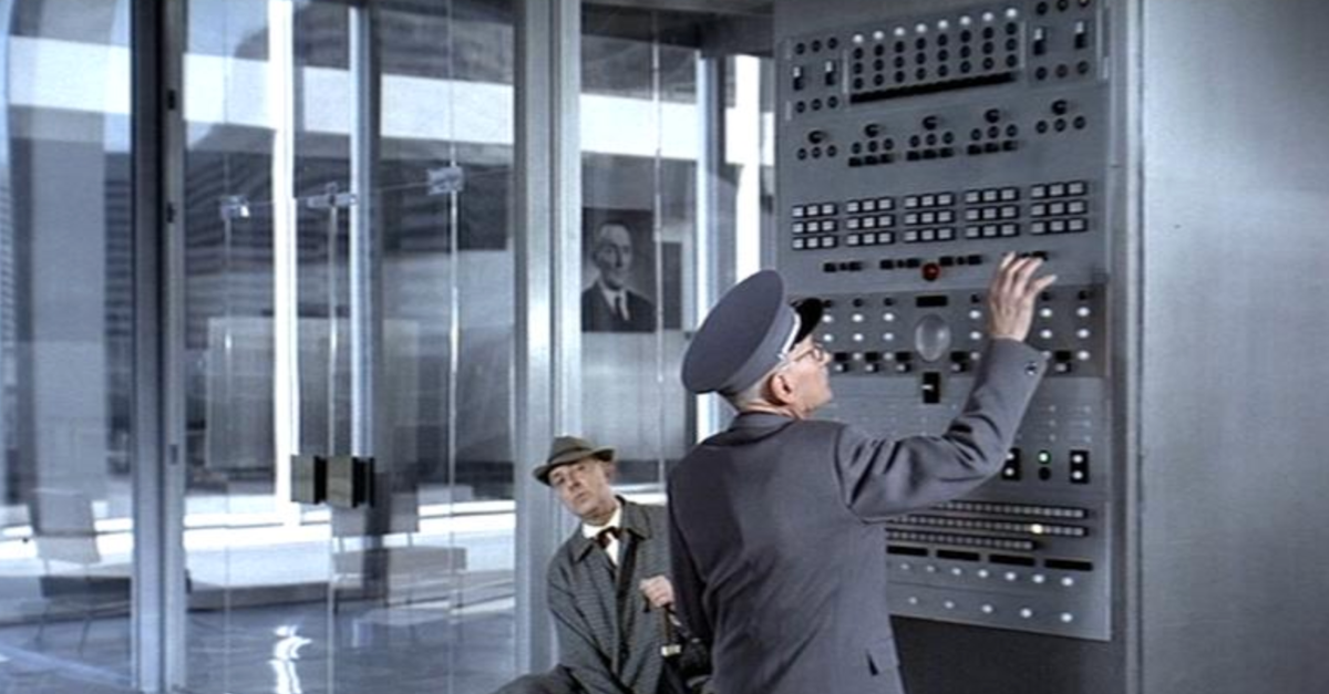
I was reminded of this recently while watching Playtime, Jacques Tati's classic cinematic take on 1960's modernity. There's a scene when M. Hulot (the main character) needs to take the elevator, and the building superintendent opens up a panel of buttons to figure out how to get the job done. There are so many buttons (way too many buttons) that we immediately feel overwhelmed by the impossibility of success. And of course things don't go well from there.
What's the ideal number of buttons for requesting an elevator? One, if there's only one direction you can go. Two, if you can go up or down. The point being that fewer buttons are almost always better. Our brains prefer less decision-making, less information to process, and less confusion and guesswork about what any extra buttons might be for.
The same is true for software. Hick's law tells us that we find things easier to use, and we make quicker decisions, when there are fewer options (e.g. buttons) to choose from. Maybe all of us involved in product design should have a picture of Playtime's "wall of buttons" on permanent display as a reminder of what not to do? Maybe Catylex should have just two buttons: (1) Load Documents and (2) Dazzle Me (with insights)? Maybe lawyers should try to express contract terms in one sentence rather than five?
If you've never watched Playtime, you should.